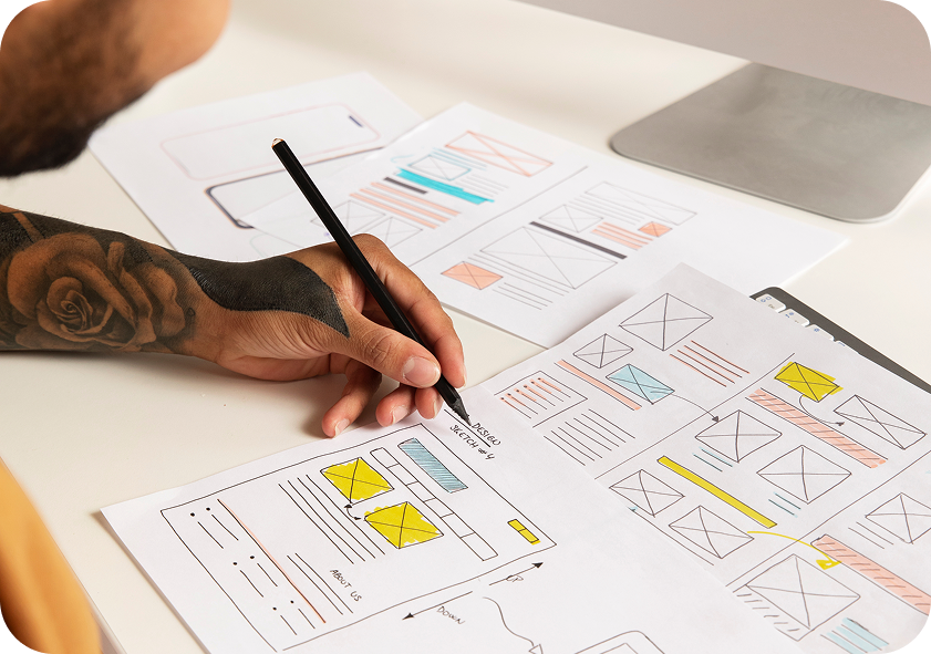
From Friction to Conversation: Using Behaviour Tracking to Improve UX
After spending thousands of pounds on paid ads and tweaking technical SEO, a real human being finally lands on your page.
They’re eager, interested, and ready to take action. But the next step isn’t obvious, or worse, the primary CTA button is hiding like it’s in witness protection.
Customers won’t fill out a feedback form saying, “I found the user interface mildly confusing, so I shall now depart.” They simply leave. No complaints. No explanation. Just… gone.
This is where behaviour tracking changes the friction in conversation, as it lets you look at what users actually do instead of guessing what users want.
What Is Website Friction?
In User Experience (UX), friction is anything that makes it harder for someone to do what they came to your website to do.
It could be:
- A confusing navigation menu
- A form that asks for far too much information
- A CTA that gets lost on the page
- A slow-loading page
- Product information that is difficult to find
- A mobile layout that requires Olympic-level finger gymnastics
You look at your homepage and think, “Looks fine to me.” But you already know where everything is. Your visitors don’t.
Instead of guessing what users want, you can look at what they actually do. Where they click. Where they stop scrolling. And, perhaps most importantly, where they seem to think:
“Erm… what am I supposed to do now?”
Watching this unfold usually makes you wonder the exact same thing: What is happening here, and why? That is why tracking user behaviour on your websites tells you far more than simply staring at your pages.
But that only works when you decide to look at real human actions rather than getting lost in high-level analytics.
Start With the Journey, Not the Numbers
One of the easiest mistakes with behaviour tracking is becoming obsessed with numbers.
- 2,438 sessions.
- 37% bounce rate.
- 4.2 pages per session.
Lovely. But what does it actually mean? Numbers without context can be surprisingly unhelpful. Instead, start with the journey.
Ask:
What is the user trying to achieve?
Maybe they want to book a service, find your contact details or download something.
Now follow that journey through the website.
- Where do they hesitate?
- Where do they turn around?
- Where do they disappear?
That is where friction starts to reveal itself.
See Where Users Click, Scroll, and Stop
Heatmaps give you a visual way to understand how users interact with a page.
And sometimes, they expose a rather awkward truth. Your beautifully designed CTA might be sitting proudly on the page… while everyone is clicking the image next to it.
Why?
Because users interact with interfaces based on what they perceive, not necessarily what you intended.
A heatmap can reveal patterns such as:
- Users repeatedly clicking something that is not clickable
- Important content sitting below the point where most users stop scrolling
- Navigation elements receiving more attention than expected
- CTAs being overlooked
- Users concentrating on one section while ignoring another
This moves the conversation from “I think this section works.” to “The behaviour suggests this section could work better.”
Session Recordings: Watch the Friction Happen
Heatmaps show you where activity happens. Session recordings can help show you how it happens.
You might see someone: Click. Scroll. Scroll back up. Click again.
It is almost like watching someone navigate a maze you accidentally built.
This is where neuromarketing adds another layer, helping you connect these behaviours with the attention, hesitation and decision-making patterns behind them.
Decoding the Silent Screams: What Are Your Users Really Doing?
When you start tracking real user behaviour, you begin to see patterns that traditional metrics don’t always explain. It’s essentially translated user body language:
| Behaviour | What It Looks Like | What It Could Mean |
| Rage Click / Angry Tap | Clicking the same spot repeatedly in a short space of time | “Why isn’t this button doing what it clearly promises to do?!” |
| Dead Click | Clicking text or an image that looks clickable, but isn’t | “Your design cues are telling me a lie.” |
| Back-and-Forth | Scrolling between sections or returning to the same area without finding what they need | “I’m looking for something, but I’m not sure where to find it.” |
| Form Loop | Entering information, hitting submit, seeing an error and trying again | “Your form validation message is about as clear as mud.” |
Once you start spotting these clues, you realise your website isn’t having a smooth conversation with people. It’s talking over them, confusing them or standing in their way.
Which Behaviour Tracking Tools Can Help?
So, how do you actually see all this behaviour happening?
Thankfully, you don’t need to sit behind your website with a notebook, watching visitors click around. There are tools for that.
Different platforms reveal different parts of the user journey:
- Google Analytics 4 (GA4) helps you understand what users are doing at a broader level, from traffic sources and page journeys to events, conversions and drop-offs.
- Microsoft Clarity gives you heatmaps and session recordings, making it easier to spot behaviours such as dead clicks, rage clicks and confusing journeys.
- Hotjar combines heatmaps, session recordings, surveys and feedback tools, giving you both behavioural data and direct user input.
- FullStory provides detailed session analysis and interaction data, helping teams investigate frustrating experiences and identify where users are struggling.
The trick is not to install every tool under the sun and drown yourself in dashboards.
Choose the tools that answer the questions you actually have.
Put those answers together, and the website starts giving you a much clearer picture of what is working and what’s getting in the way.
OK, so you might be thinking: now I know what friction looks like, let me get the scissors and cut it all off.
Hold on. It’s not that simple.
Friction Isn’t the Enemy. Accidental Friction Is.
A lot of bad friction deserves to be shown the door: pointless extra steps, confusing flows and dark patterns that exist purely to extract more money or attention.
But there’s another kind. Intentional friction.
The sort that makes you pause for a second before deleting a project or confirming you’re about to notify 144 people across nine time zones. Knowing when to remove friction and when to keep it is where good UX design services make a real difference.
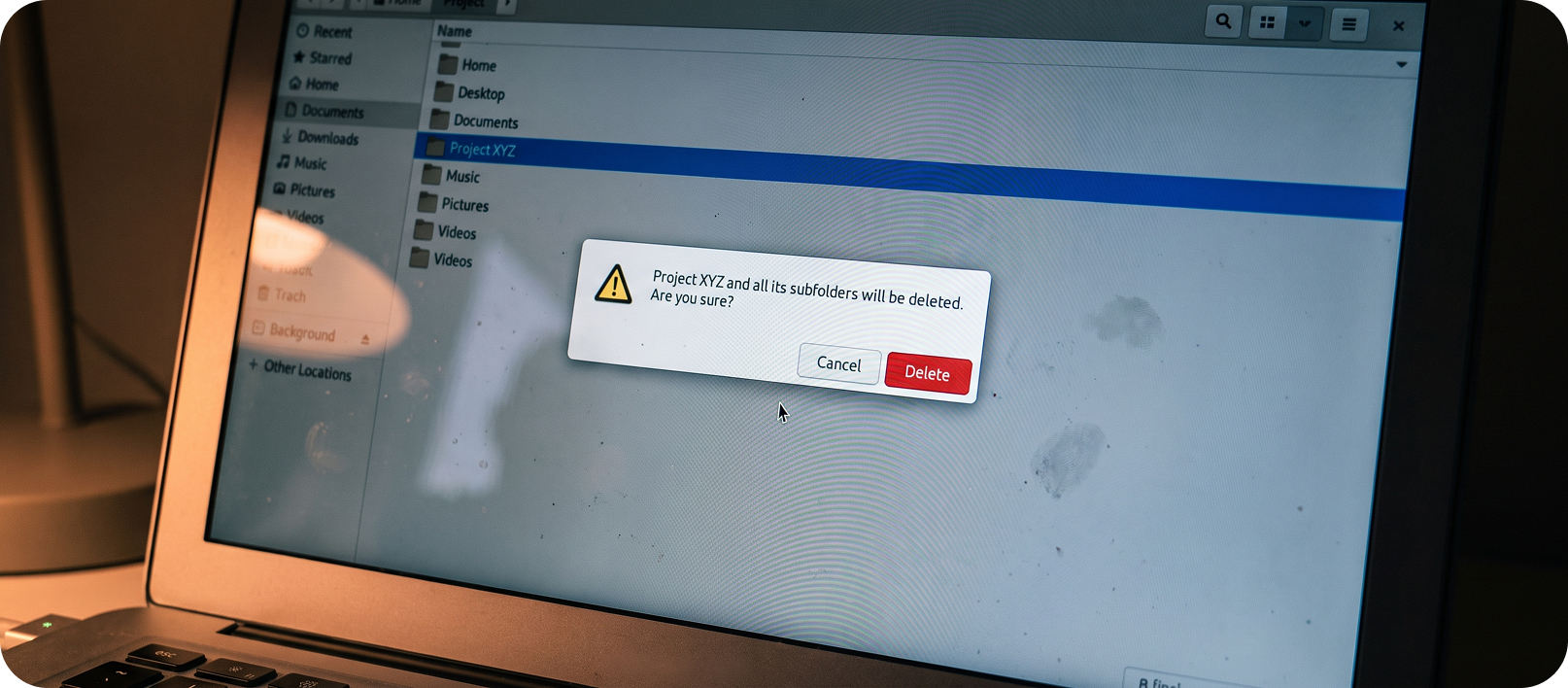
These moments turn friction into a useful conversation, helping users pause, reconsider and make better decisions.
How to Sort the Good Friction From the Bad
When you watch real sessions and look at the data, the quality of the friction becomes easier to assess.
Here are a few ways to separate the two:
- Intentional vs accidental: Was this pause designed with a clear purpose, such as preventing an irreversible mistake, or did it appear because of inconsistent components or technical debt?
- Proportional vs disproportionate: Is the amount of effort matched to the risk? Asking someone to type a project name before deleting it is proportional. Making someone solve ten increasingly difficult puzzles just to log in is not.
- Supportive vs frustrating: Does it feel like the product is looking out for them, such as Gmail’s undo send, or like it’s getting in their way for no good reason?
Behaviour tracking doesn’t answer these questions on its own, but it gives the team shared evidence to work with.
Turning Insights Into Better Design
Behaviour tracking isn’t magic. But it does give you something far more useful than opinions when you’re trying to decide what not to build.
Here’s how it actually helps in real conversations with clients
Watch More Than You Assume
Heatmaps show the pattern. Session recordings show the person behind it. You see the hesitation, the mouse circling, and the quiet exit.
It’s the closest thing we have to reading someone’s mind. If people are already struggling, adding another element rarely makes things better.
Don’t Just Collect The Data. Use It
Play the awkward recordings in the meeting. Let everyone watch a real user get stuck. It lands harder than any slide deck ever will.

Once someone sees the frustration for themselves, the urge to “just add one more thing” usually quietens down quite quickly.
Pair The Numbers With Actual Humans
Behaviour tracking tells you what is happening. A few proper conversations tell you why. When both are pointing the same way, instead of you telling the client to drop it, the client will say the words “let’s not build this” and work on what we already have.
Watch For The Quiet Friction Too
Not every problem is a big dramatic drop-off. Sometimes it’s the tiny extra clicks that slowly wear people down. Death by a thousand paper cuts. That extra modal or extra step can look completely harmless on a wireframe… until you see how it actually feels in someone’s hands.
The point isn’t to block ideas. It’s to make sure the ones that do get built are the ones that genuinely help, instead of the ones that only feel like progress in a meeting room.
And yes, privacy matters. Be transparent. Don’t be creepy. Behaviour tracking should help you understand users, not make them feel watched.
Smooth Operator: The Final Verdict
At the end of the day, UX design is an ongoing dialogue between your product and the human sitting on the other side of the screen.
When you use behaviour tracking to spot friction, you’re not just chasing higher conversion rates. You’re showing your users basic manners.
You’re removing the unnecessary bumps in the road so the experience can actually flow.
So, when was the last time you watched a real user navigate your app without jumping in to save them?
Try it this week.
It might be eye-opening. And slightly painful.
But it could also show you exactly where your UX needs a little less friction and a little more conversation.